


About the Econ department
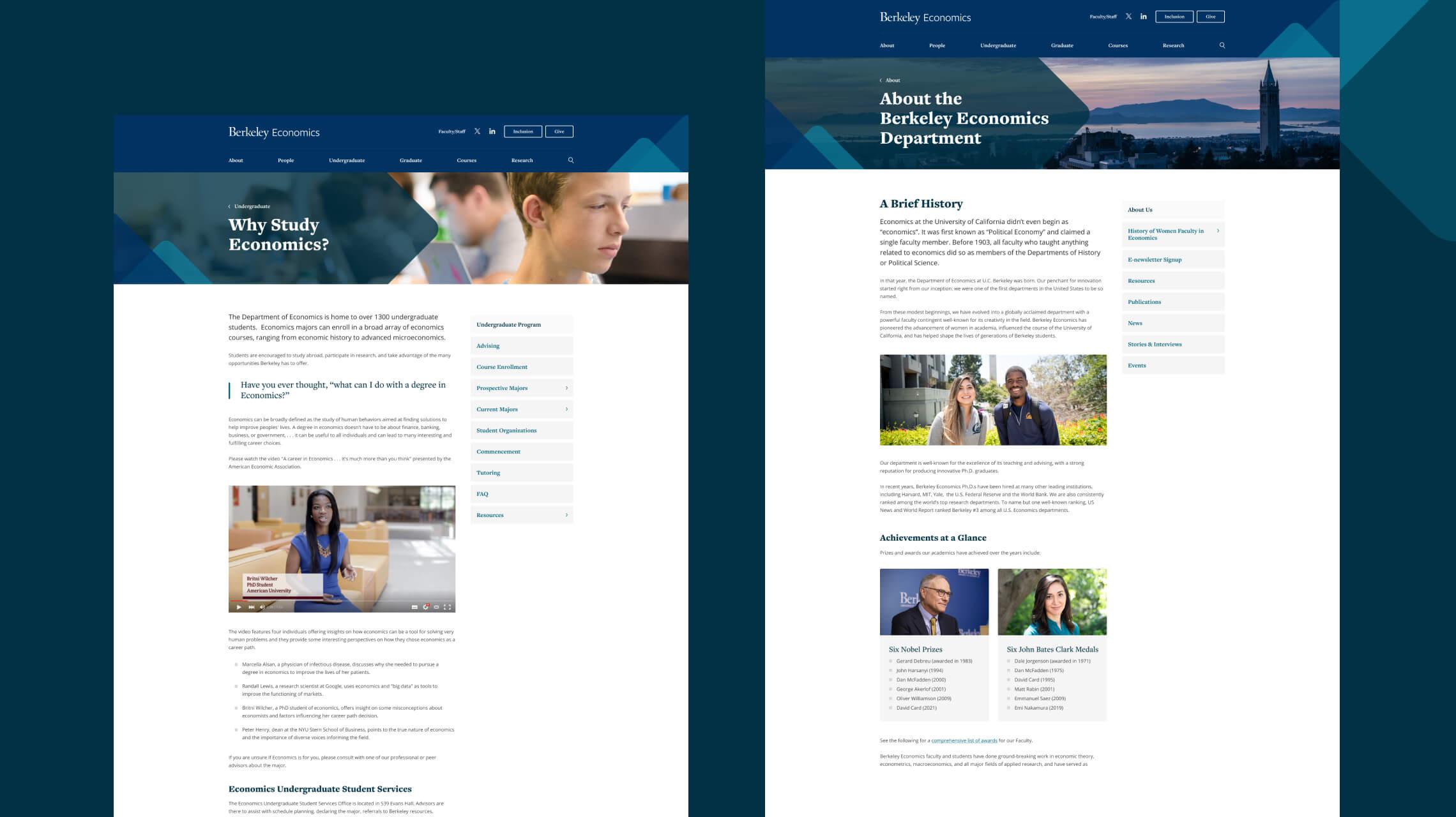
Economics at the University of California didn’t even begin as “economics”. It was first known as “Political Economy” and claimed a single faculty member. Before 1903, all faculty who taught anything related to economics did so as members of the Departments of History or Political Science. In that year, the Department of Economics at U.C. Berkeley was born. Their penchant for innovation started right from inception and were one of the first departments in the United States to be so named.
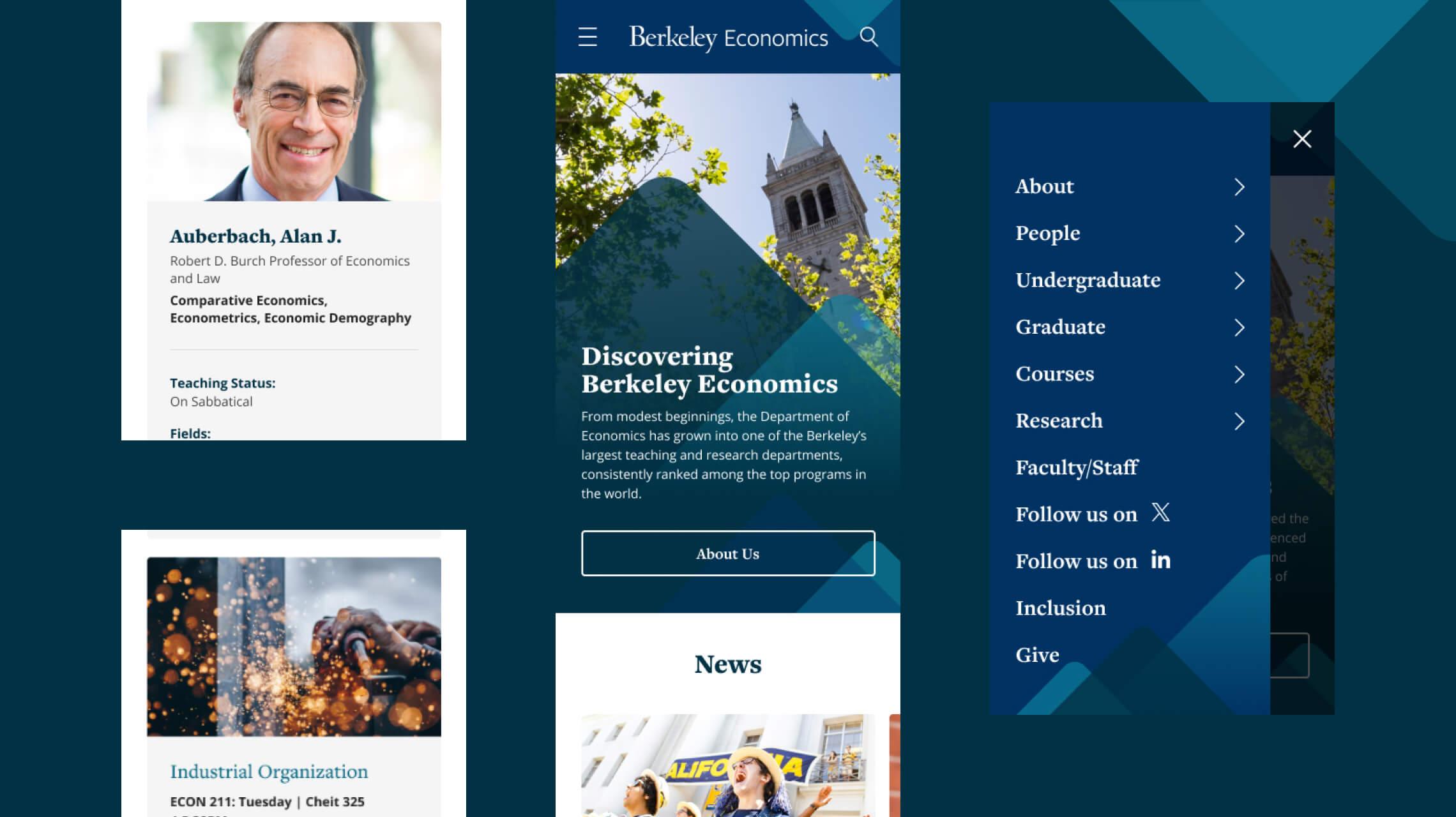
When Black Antelope were presented with the task of translating and updating the department’s online presence across to the Drupal platform, the current website suffered from web compliance and accessibility issues as well as a distinct lack of personality amongst a sea of Berkeley department sites (many having recently been updated by our agency already). Most key pages were very text heavy and challenging to parse, without clear separation or focal points and a stronger navigation structure was required to ease the user journey, with a strong focus on elevating a limited and mobile experience.
Focusing on core & unique content presence
Throughout the design process, our aim was to bring key elements to the forefront of each page, highlighting the department’s focus on diversity and inclusion or how viewers can support and give to Economics. We incorporated visual focal points such as:
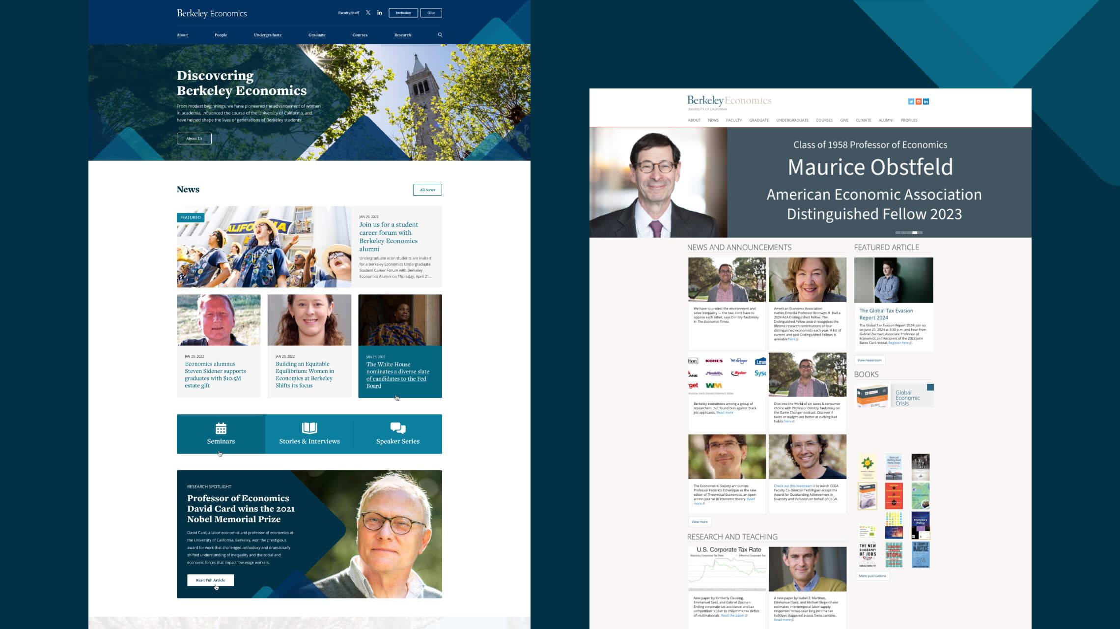
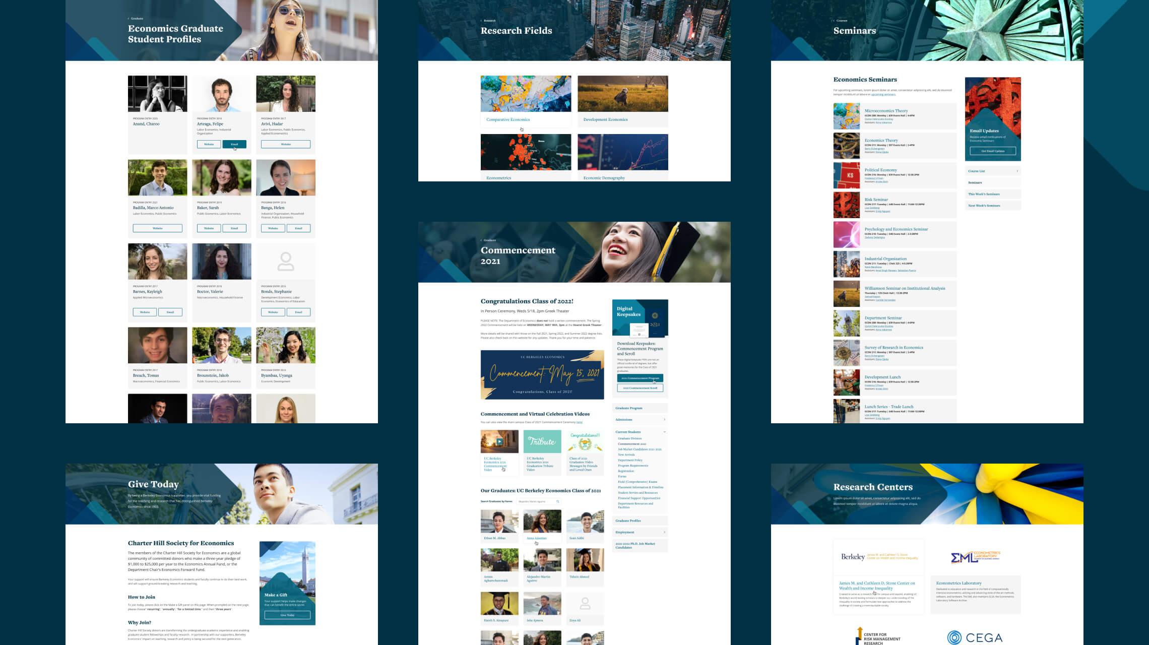
- Spotlighting research fields to promote the various project endeavours of the department, both on the homepage as teaser content for awareness and their own category section.
- Highlighting prominent academics in their field and featured news articles to give more attention to core areas of the website.
- Promotion unique department offerings through their seminars, interviews and speaker notes.
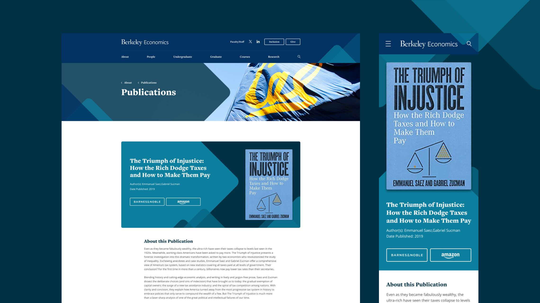
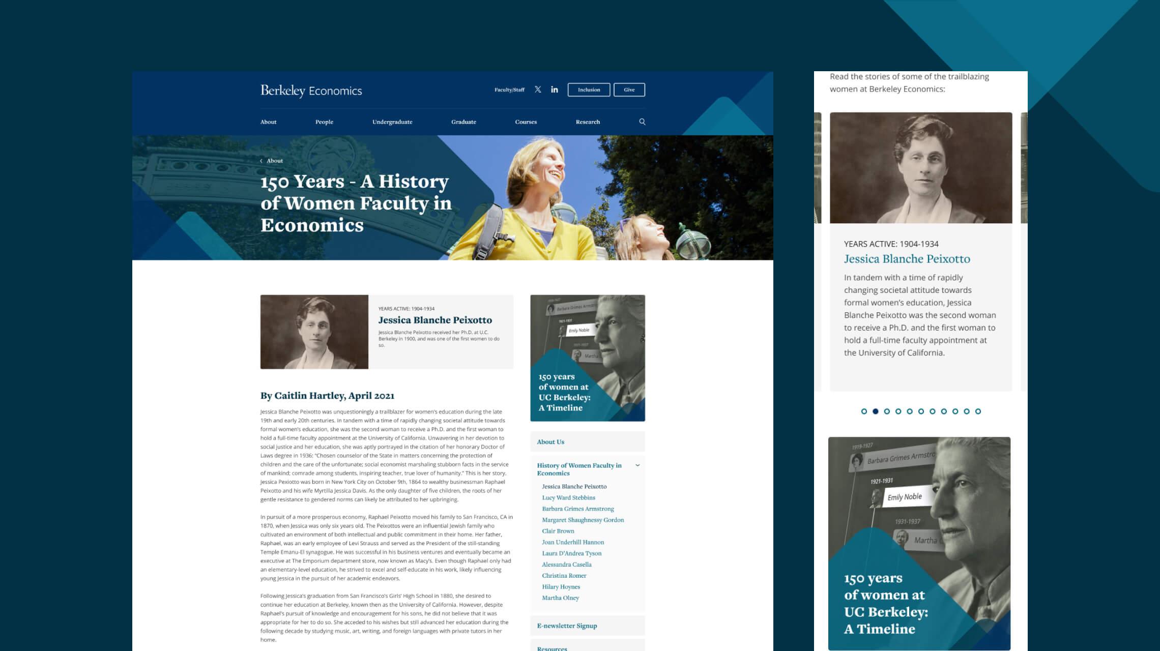
- UC Berkeley has a exceptional and rich history of women faculty in Economics spanning over 150 years and it was important to both celebrate and inform readers of the importance and impact of their admission “on equal terms in all respects with young men” as faculty in the Economics department.
This, in particular, was one of the first areas we considered to better showcase the achievements of the department and its faculty members by introducing a more visually prominent series of biographies, timeline information and individual biography pages for each of the trailblazing women in the department across those 150 years.
Elevation over excess
The new website had to not only be more functional, efficient and visually engaging, but had to be considerate of the existing content needed to migrate across whilst not overburdening the Economics department with more work than necessary to add new content to the site. The impactful graphical accents spread throughout each page to accentuate the content and give that distinctive look to the department, were implemented as separate elements to allow new imagery and text to applied whenever needed. The end product is a more visually engaging and dynamic presence in appearance, with flexible modules and page elements to streamline the process of editing or adding new content.

As part of the desire to improve accessibility, we also wanted to ensure that we improved upon the usability of the website with interaction design, augmenting the user experience and ultimately enhancing user satisfaction by clearly defining page progress through color, contrast and animation systems:
- Strong color contrast for hyperlinks allow easier identification of text links anywhere on a page, such as a significant visual difference in text color or weight between body text and a text link. This also applies to call to actions in the header, footer and buttons/spotlight panels throughout the body area to create meaningful focal points throughout the user journey.
- Strong shape contrast, not only between text and hyperlinks by implemented an underline for body text links that transitions out on hover, visually indicating to the user through the change in shape appearance that they have interacted with an element on the page.
- Animation demonstrations were created and provided as part of the design process for production to guide more advanced transitions of content to create more engaging experiences and help users to achieve their objectives in the best way and as effortlessly as possible. Incorporating parallax scrolling, easing transitions for text and buttons, applying a 5% zoom to images on hover and general global active, default and hover states for elements were all provided to enrich the intuitive and pleasant feedback throughout the site.
These elements are a marriage of subtlety and eye-catching engagement, defining a professional, contemporary approach befitting the standards expected by the department itself whilst not being overbearing, garish or distracting.
I highly recommend working with Black Antelope. I have extensive experience contracting out for technical services; this was by far the most positive.
Phil Walz
Department of Economics @ UC Berkeley
I highly recommend working with Black Antelope. I have extensive experience contracting out for technical services; this was by far the most positive.
Phil Walz
Department of Economics @ UC Berkeley
Responsive design as opposed to ‘mobile-friendly’
While the target audience for the department of Economics’ website is anyone interested in discovering more about the department’s pursuits, achievements and courses, the larger demographic expected to find the most use from the new site as a resource are existing and potential students. With the ever-expanding influence and popularity of mobile devices, that audience would be found wanting if the content and presentation of it was not displayed in the best and most adaptive manner possible across devices, be it a mobile phone, tablet or laptop/personal computer.
It isn’t enough to have a mobile friendly approach that has the website looking good on mobile devices, yet has difficulty translating the same information across devices with differing resolutions, or worse still, removes content or impacts part of the experience to a degree that is noticeable across devices. By providing a fully responsive solution, you reduce the impact on the journey and increase user traffic across platforms, whilst limiting cost and maintenance needs.
A significant part of the design and production process is to cater to multiple sizes and breakpoints, defining the most suitable layouts and content order based on screen size during the design phase, with extensive testing and implementation during the production phase.
Distinctive branding in an evolving environment
As touched on previously, a significant portion of the design process involved creating a new visual style for the website. UC Berkeley have had a set of brand guidelines established for years, replete with guidance on typography, color schemes, geometric patterns and accents aimed to give each department an identity while appearing as a cohesive whole representing the university when looked at collectively. With Black Antelope retained to product department websites now well into double digital for the brand, each new department offers its own set of challenges in setting a unique presence online.
But one enjoyable aspect of working with UC Berkeley, is their flexibility in accommodating suggestions and design direction within those guidelines, pushing the envelope and evolving the brand beyond the original plans laid out for it. So much so that we’ve expanded exploration into unique accents, more accessible color schemes and tailored typography families that suit each new website.
Which is important, as even as recent as mid-2024, the guidelines have seen another modern update, retelling the approach in branding once more, so our work to some extent had to be just as flexible so that it would stand up against future changes without looking alien to any brand changes, within reason.
Angular, pyramidal accents and flourishes are neatly strewn throughout each page, drawing the user’s eye to key information, housing points of interest or framing impactful content. These accents were initially too harsh with more solid colors and sharp endpoints, but by softing the edges, adding opacity and overlapping elements - we were able to find a contemporary and pleasing visual balance and identity.
This softening then informed the rest of the design system, incorporating rounded and softer edges to content cards, call to action buttons and imagery for a cohesive approach. This, combined with more rounded and less traditional font options (without detracting from legibility or page parsing) and a color scheme that compliments the soft edges of the theme, allowed for clear focal points, impactful content blocks and easily separated content blocks and modules that could be utilised anywhere on the site.
Quality, assured
As part of our process and service, we dedicate a significant amount of time delving through our responsive websites during Quality Assurance phases, which occur both during production ahead of the live site launch, and post-launch were we maintain design systems and also add to them in the form of new page or sectional content when needed.
- Desktop breakpoints are assessed for both standard and retina-display screen sizes down to the minutiae of any given page (typically we have considered all unique page layouts and templates as part of the design process, making it significantly easier to assess issues or changes required by using a direct 1:1 comparison between development page and design page.
- Mobile breakpoints are then reviewed and assessed by various criteria - ensuring that everything from font size consistency, color cohesion, and image treatment are applied universally and in line with the newly established design guidelines.
- Spacing is arguably an oft-forgotten consideration, with what is present on the page easier to focus on and refine. But ensuring the same attention to detail in regards to spacing and alignment from initial design concept through to a website’s launch will ensure that not only will content be allowed to breathe and flow as intended, but impacts how easy it is for a page to be parsed, content blocks distinctly separated and digested, and overall page presence as pleasant and inviting to the audience as possible.