About SPCAI
SPCA International is an international non-profit supporting local animal welfare organizations and programs worldwide, including shelters, dog and cat rescue operations, and wildlife rehabilitation centers. SPCAI also provides valuable educational resources to help people take action to improve the lives of their pets and animals in need.
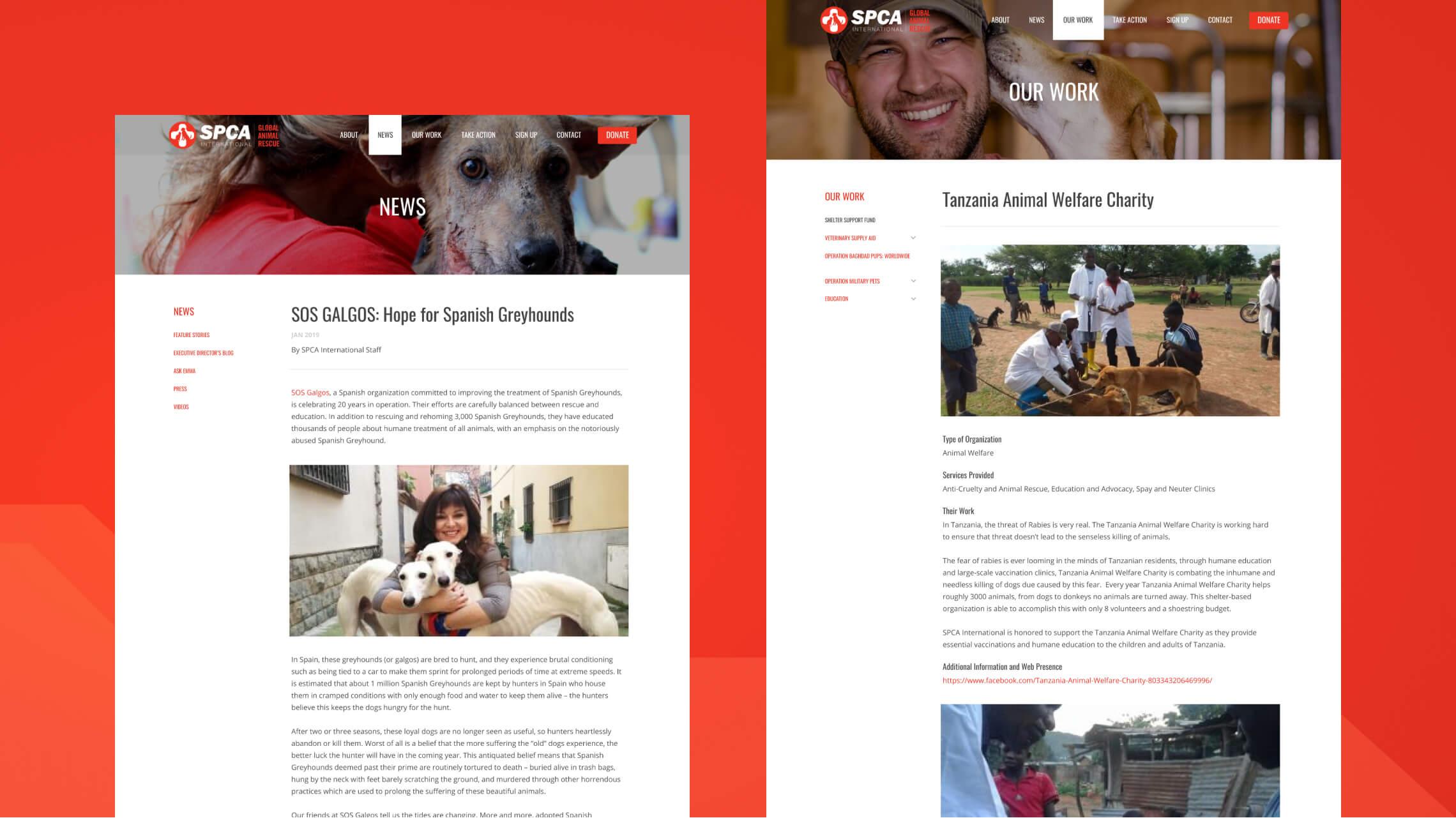
For the first time in more than a decade, SPCA International was ready to reorganize their content and redesign their website. SPCAI came to Black Antelope for a redesign of the website, an optimized mobile experience, a complete overhaul of the site’s information architecture, and a much more intuitive CMS experience for members of the team.
Change begins in the home... page
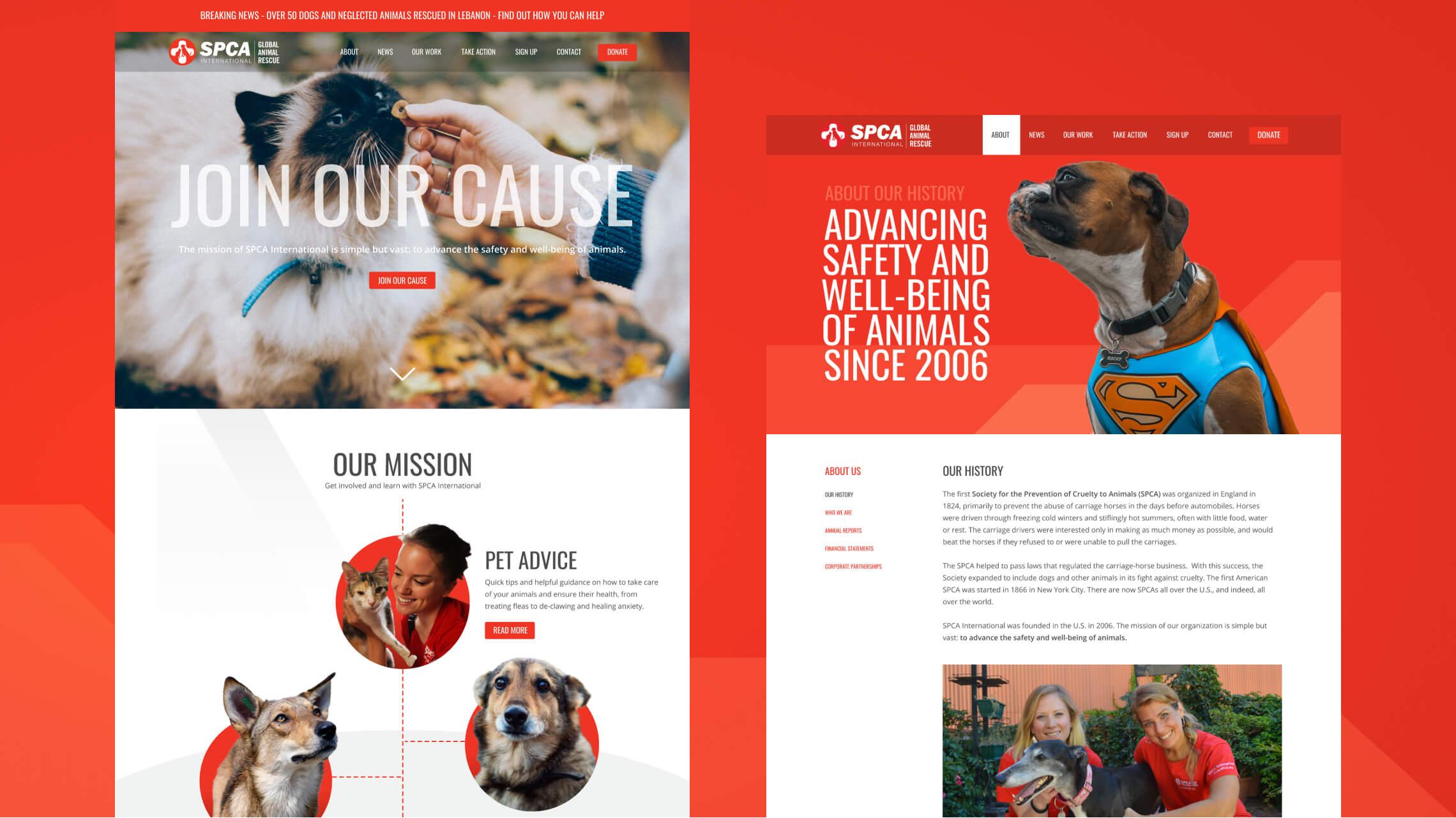
A staple of our design process is to split the project between desktop and mobile phases, and splitting the desktop phase between approval of the homepage and the rest of the suite follows thereafter. This is typically because the homepage acts as your first foray into the online presence of any client, and is where the style is initially defined from first concept to revised final product. Once the homepage is established, it stands as an initial global style guide that dictates the design language for the rest of the design project. For SPCAI, not only was this not an exception, it reinforced the rule itself.
After more than a decade since the previous iteration of the website had launched, a fresh and modern approach to the content and conveying the message was critical. This involved a complete deconstruction of existing content, rebuilding it into easily-parsed, responsive content that stood as impactful in design as the conveyed message was. We achieved this with leaning heavily into the bold and vibrant reds and stark blacks of the existing branding, and combined this with complimentary large impact typography, healthy spacing and splashes of solid block colors. Angular accents were also added to the design language to add further impact and visual interest to the sectional panels.
For the homepage, we integrated a variety of powerful elements to engage the audience from the outset, including:
- Full width video hero panel with prominent message tagline.
- Sprawling and animated infographic depicting the key areas and tenets of the SPCAI mission statement and objective.
- Interactive global impact map showcasing the significant effect SPCA International has had on helping thousands of animals worldwide, with overlays detailing more information for each country.
- Bold full width panels highlighting the latest news and updates, success stories, how you can donate and subscribe, and a media gallery showcase.
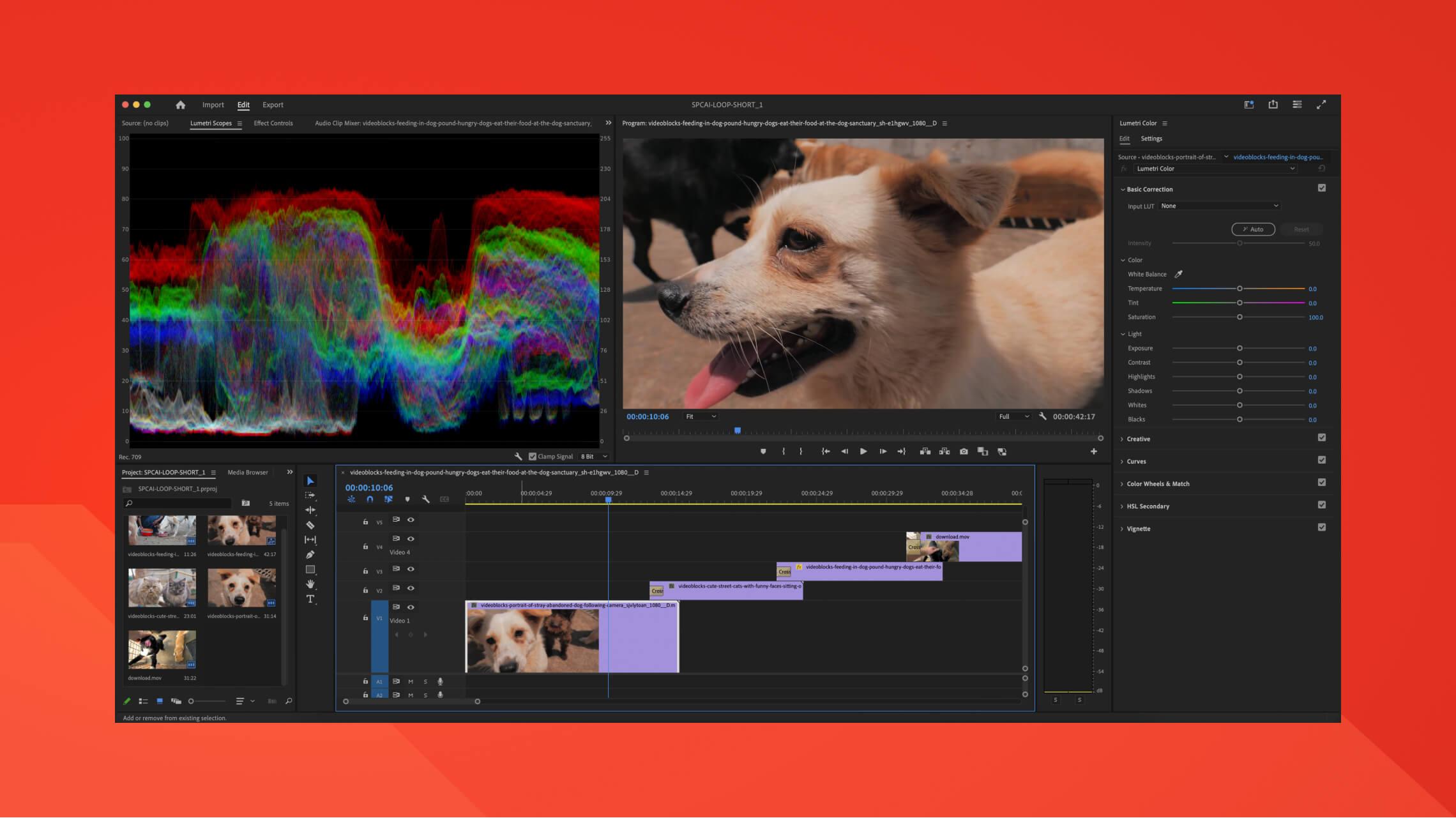
Video editing
If “a picture is worth a thousand words,” what is a video worth? To accompany the potent slogan of ‘Join our cause’, the large full width hero banner on the homepage is your initial introduction to the new website. At first, we wanted to utilise the rich photography provided by the client, again avoiding stock assets where possible to bring the user further into the real world of SPCAI’s mission. Once we realised there was actual footage from the locations SPCAI works in available to us, we mocked together some static sequence stills for the concept and approval, before ultimately moving forward with creating a short video loop, without audio, that would automatically play and repeat as the background for the hero banner instead. This draws the eye immediately to the movement of the video and the overlaid large font messaging to join the cause.
We used Adobe Premiere Pro to trim, splice and slow down several clips into the 30 second loop currently on the website (the initial comps were original set to normal speed and over a minute long with much more content, but reducing the footage and halving the run-time while also slowing down the clips seemed to give the video more impact!).
Imagery that stands out
While we used a significant amount of stock photography of animals befitting the tone of the new aesthetic, we also received a large amount of in-situ and real-world SPCAI photography of their team and mission, most of which was incorporated into the final outcome you see today. It cannot be stressed enough that while stock photography and online libraries can offer fantastic results, there’s no comparison to having a client that can provide their own resources, and SPCAI is truly no exception. As a result, we were better able to capture the passion from the SPCAI team, the harsh reality of how poorly animals can be treated and the dire need for more support - using client provided assets really allows the viewer a far more accurate and real insight into the plight and mission at hand.
We used several image cut-out techniques and overlap effects to let the imagery leap from their surroundings, and while always aware of the serious nature of the mission and messaging, tried to add brief moments of levity through the image choices to highlight the joy that safe and healthy animals can provide.
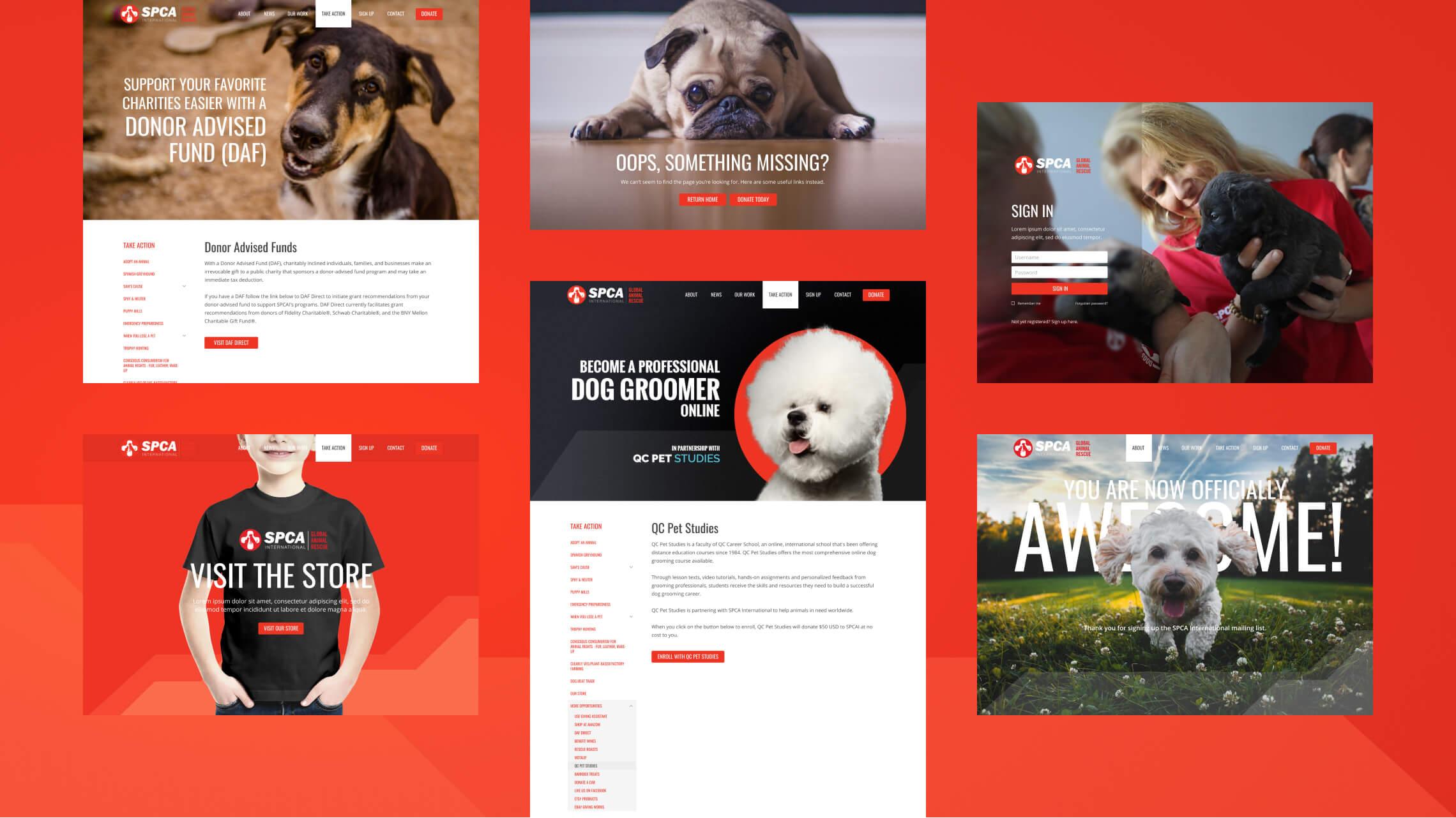
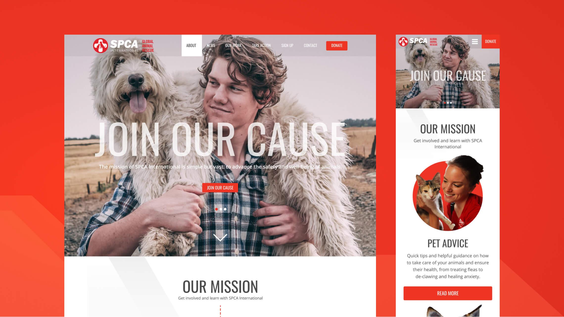
1:1 mobile parity
As part of the project scope, we were required to deliver a direct 1:1 suite of mobile designs for each of the desktop pages created, to give the utmost clarity and guidance to our production team. This was particularly important due to the limited responsiveness of the previous site and because of the ever-growing mobile audience using SPCAI’s online presence as a gateway to the animal welfare world. We wanted to ensure that the new website was as user-friendly across devices as possible to allow as many eyes as possible on the critical work that SPCAI undertakes, granting a smooth and enjoyable journey for every user.
The mobile-friendly approach to all of our websites promotes SEO benefits for search engines, like Google, to prioritize our clients in their rankings and further attracts more organic traffic, which was even more important to the new SPCAI online presence. We also wanted to make sure that we reduced bounce rates through our restructuring of content so that particularly for mobile, the flow of content in a single column format retained visitor engagement throughout.
It was also important to demonstrate how some of the lengthy components of the site (such as the infographics and interactive map of the homepage) would translate fluidly into a single column format. These complete like-for-like series of desktop and mobile design suites acted as an expanded style guide for production (along with actual style guidelines we include as part of our handover tasks!).
They’re responsive to our needs and requests and are so knowledgeable. They’re really easy to work with, creative, technically savvy, and willing to fill gaps in our staffing. All of that is really helpful and we don’t know what we would do without them.Stephanie ScottSPCA International
Supporting SPCA International
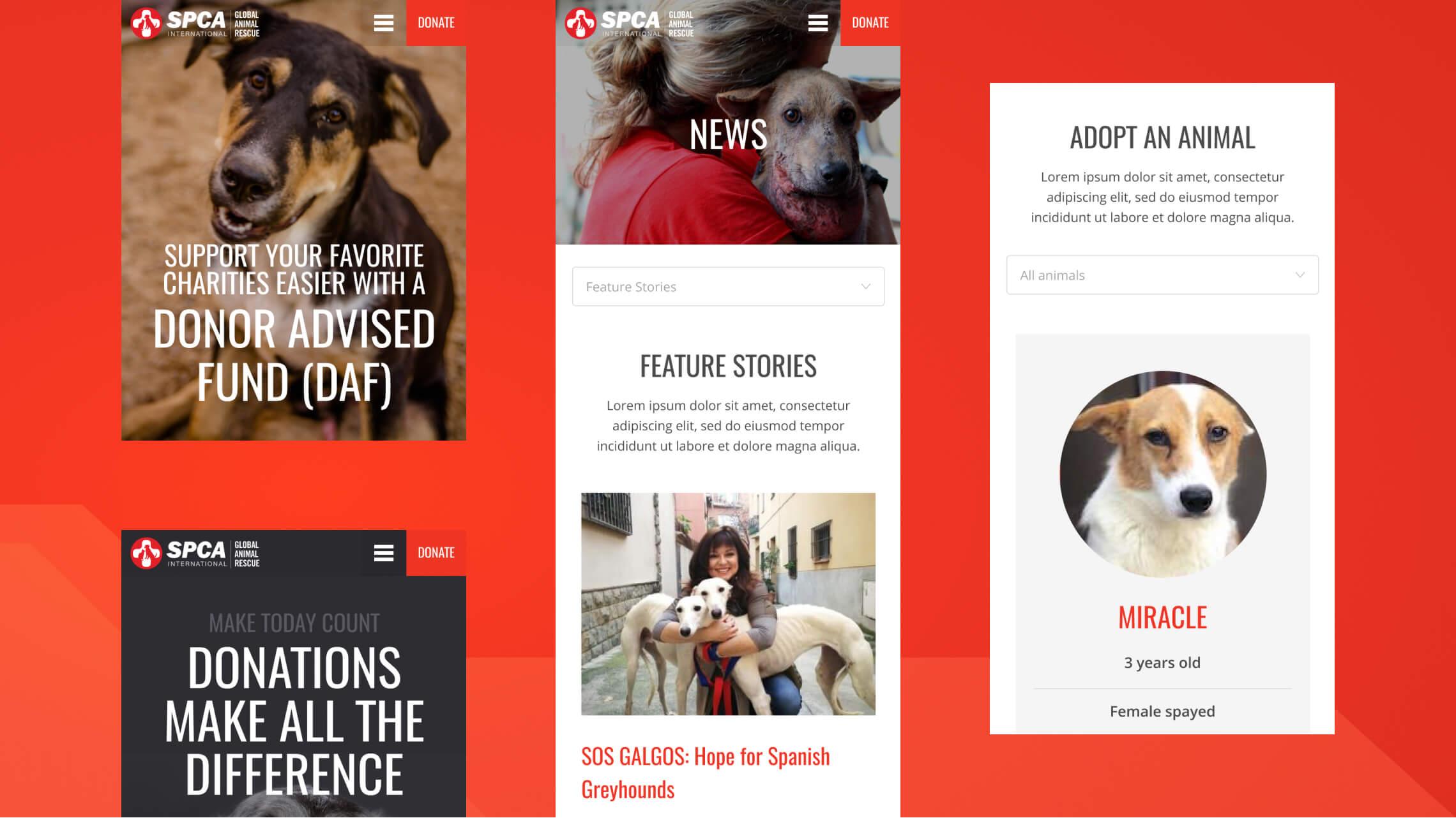
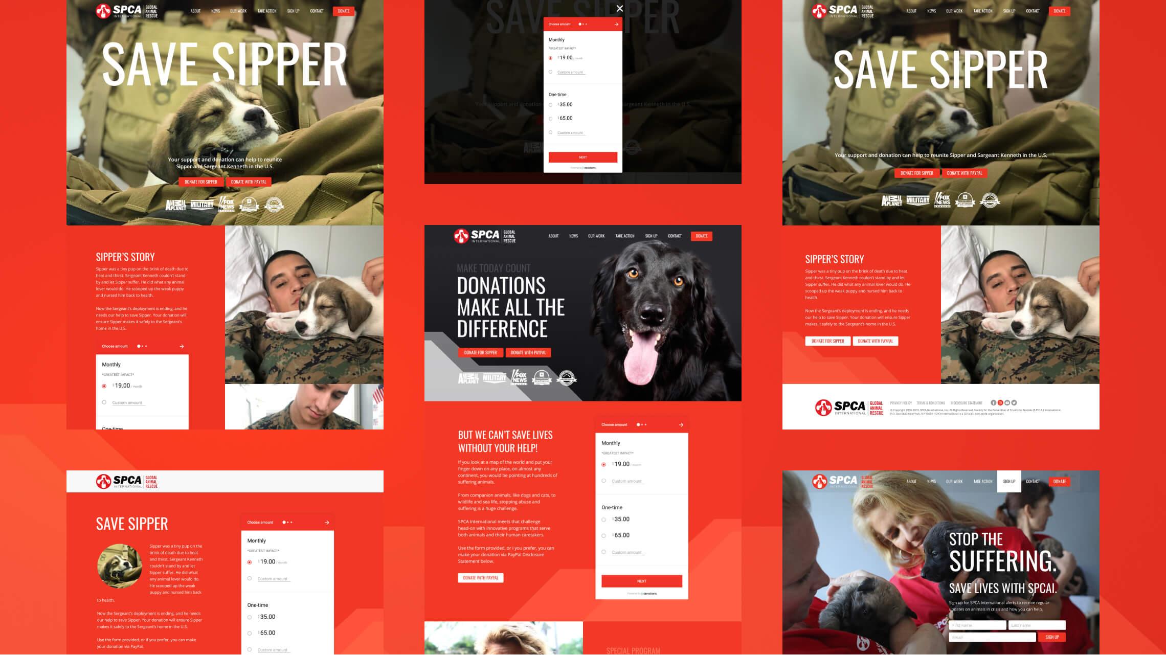
With hundreds of suffering animals at any given place on almost any continent, SPCA International’s work is vital for awareness and saving lives. With their innovative programs helping all animals from companions to wildlife and sea life, it is a huge undertaking. Donations support their rescue mission and truly make the difference, so not only did we make DONATE the most visible link in the header navigation, we incorporated a bold and graphic-based donate panel across every page as part of the footer section too for added prominence and awareness.
As part of this objective, we created not only a general/default donation page, but a landing hub series of special programs with customisable and modular layouts to accommodate current programs such as Military Rescue and the Shelter Support Fund, as well as future specialised areas of service. These layouts typically used large imagery, bold block colours and impactful messaging to show what programs SPCAI are involved in and how you can support them. Donations themselves were using a third-party provider and would remain so for the new website, but we created style examples for this panel as part of the new design guidance.
Customer satisfaction x team passion
While the creative team at Black Antelope take pride in all of our projects with as much of a focus on customer satisfaction as best practices and accessibility standards, the overhaul of SPCA International was more of a passion project for us. We are all huge animal lovers (our Creative lead has a household of eight dogs himself, many adopted), so both the effortless client communication and the source material itself made this project a true joy and privilege to undertake, and an honor to be tasked with updating the decade old original website. We have been fortunate enough to work on several non-profit client projects like SPCAI that resonate so closely to our own world views and hope to work with more like-minded and crucially needed clients in the future.