About the project
Faunalytics’ mission is to empower animal advocates with access to research, analysis, strategies, and messages that maximize their effectiveness to reduce animal suffering. They achieve this by conducting essential research, maintain an online research library, and directly support advocates and organizations in their work to save lives. The range of data they offer helps the movement understand how people think about and respond to advocacy, providing advocates with the best strategies to inspire change for animals.
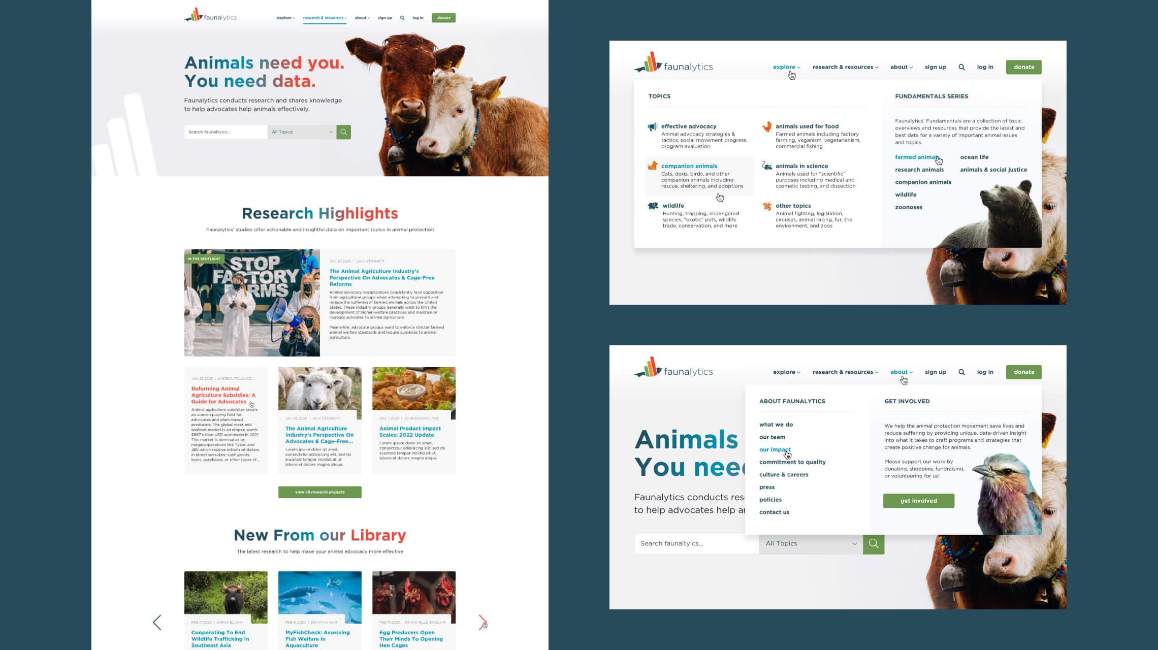
Tasked with spearheading the design suite for the new Faunalytics website and preparation for production, we wanted to introduce considerably more animal photography into the concepts than the original website which was very text heavy, but in a way that unified the appearance of the site in a consistent fashion. This, alongside heavily restructuring and streamlining the existing content and articles allowed for a richer user experience across the website.
Appearance is not everything, but it helps
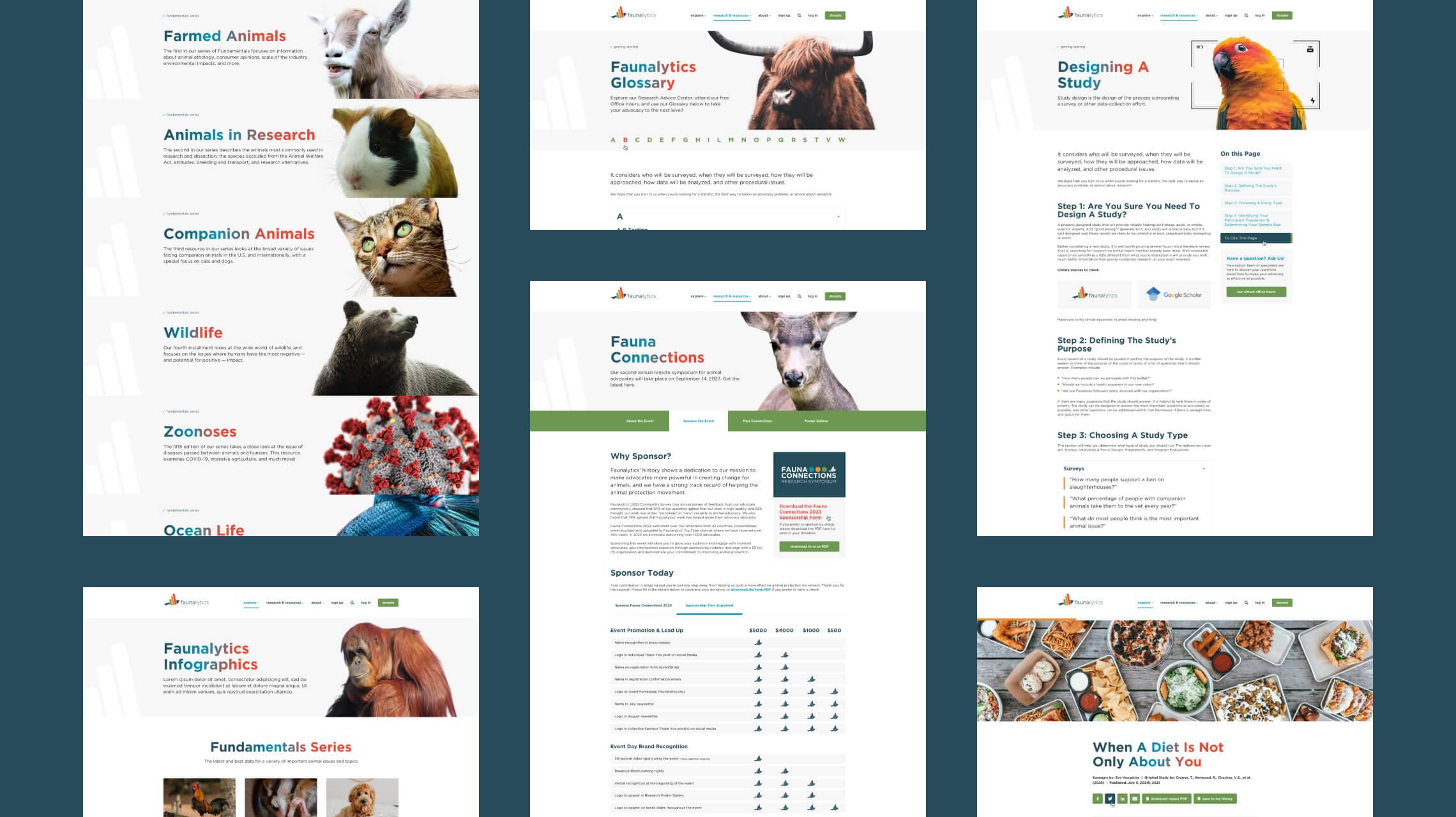
Barring a handful of pre-existing high resolution assets, there were no client provided resources available for imagery, so with stock assets being required it was important to give them a cohesive treatment as if from one source, one voice. We wanted the animals to be the central focus of the photography and visuals, and by removing the backgrounds for each header (and in key areas of the site that would call for it), this not only gave them focus but made the imagery look like a series, a collection all complimenting one another.
The added benefit of the decision to remove the backgrounds was that it gave us freedom to add these images in any area of a given page, as well as utilize engaging overlap effects with the content. For example, with the brand mascot being the multi-colored bird, we were fortunate to find a related wildlife shot of a similar avifauna that was utilized across the site, particularly the support section. Ultimately, the imagery served their purpose by giving warmth and connection to the welfare content provided on the site.
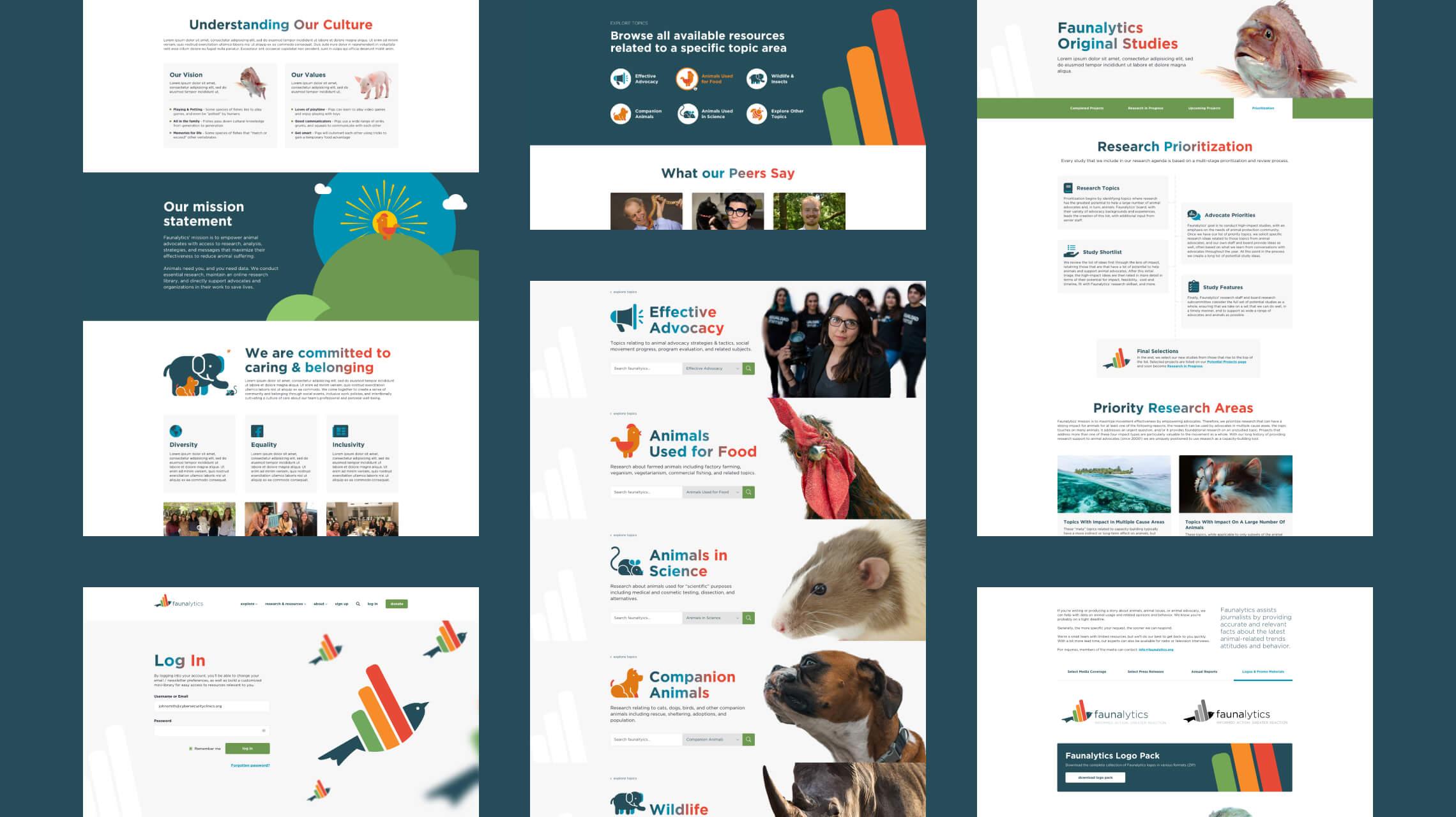
To bolster the look and feel of the site, an entire collection of bespoke duotone iconography was established very early on in the design phase and used across the entire site from the navigation menus, categories, featured landing page panels and more. The style was in keeping with the same treatment and palette as the Faunalytics bird mascot itself to further tie the new website aesthetic into the branding. This was particularly important as there were many pre-existing animated data visualizations that would not be updated stylistically yet still had to look like part of the new design language and aesthetic.
Responsive design and IxD guidance
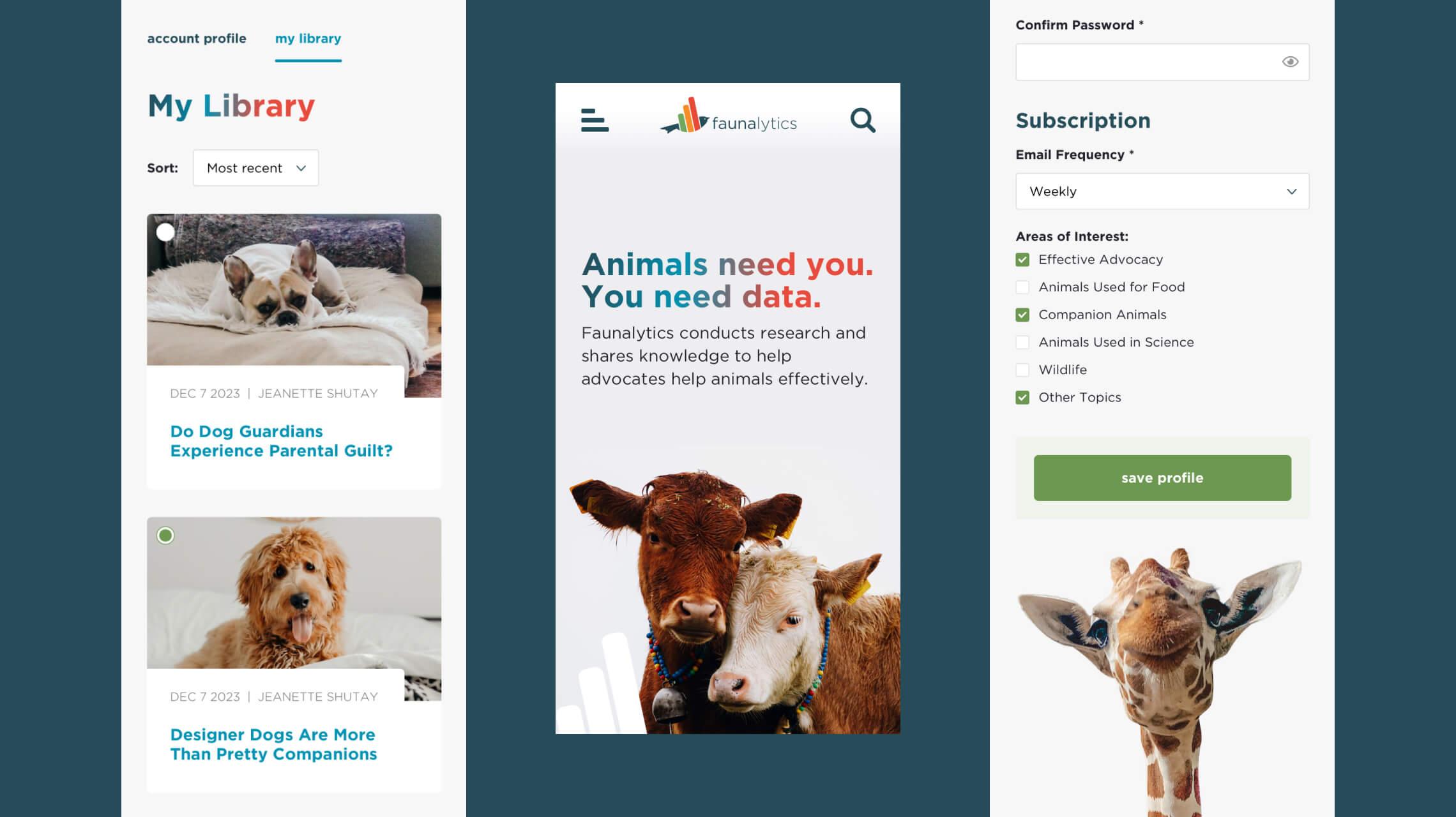
While Black Antelope had been charged solely with the design portion of the new website, we of course ensured that as much guidance for the client’s production team would be given in both the desktop suite of templates that would encompass the vast core of page layouts, but also a subset of mobile/responsive designs that would further guide the build process. The mobile suite gave a comprehensive understanding of how the often page specific content should be handled and translated down to a single column structure for mobile viewing.
With this in mind, a large mobile subset of pages was defined and created alongside the client’s feedback and response now that the new site would be responsive. In addition to this, we also gave recommendations and animation mockups to the production team as guidance for interaction design (IxD), and where it was most appropriate to use. Our philosophy with interaction design is less is more, to let the content be king. Examples of subtle transitions including a shape or color change to hover states on links or call to action buttons, a hint of image zoom when hovering over an article tile, having the search overlay in the header smoothly move into position when selected as opposed to an instant or often jarring single-frame positional change - it helps enhance the content and use of the site but neither detracts or takes focus from it.
New look, new functionality
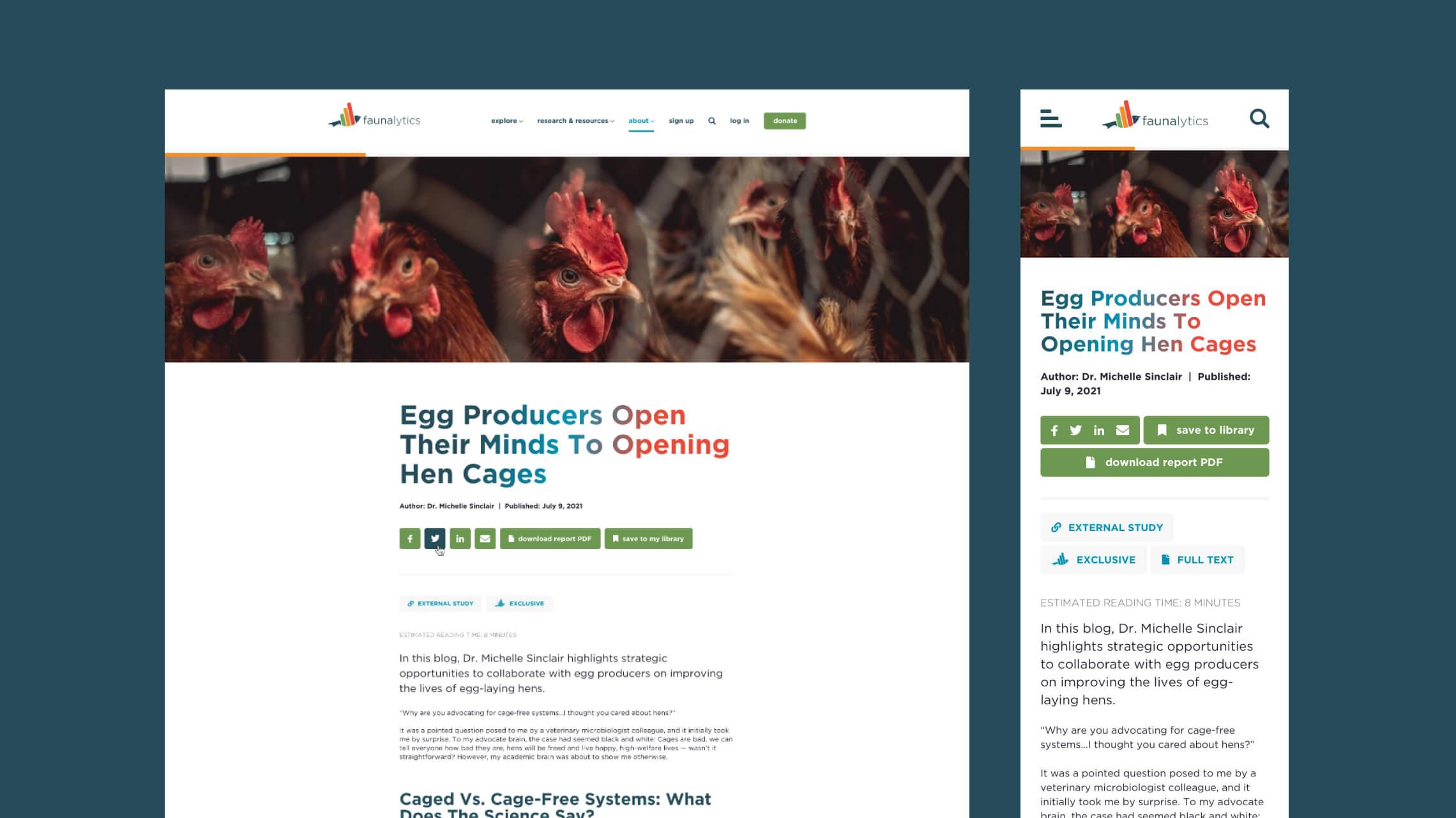
Faunalytics houses many important and sprawling sections of research and information, of which blog articles and original report content are a considerable component. Not only did we endeavor to improve the hierarchy, style, order and general flow of the article layouts, but we incorporated new and rich features to enhance the experience and keep readers, well, reading!
- Enhanced social and sharing interaction as part of the new structure.
- The ability to download an available report PDF of an article if available, as well as save an article to your personal library for future reference and reading.
- A high visibility reading progress bar pinned to the top of the page on scroll to indicate progress and article completion.
- Estimated reading time status to indicate the expected length of the article ahead of reading.
Found in translation
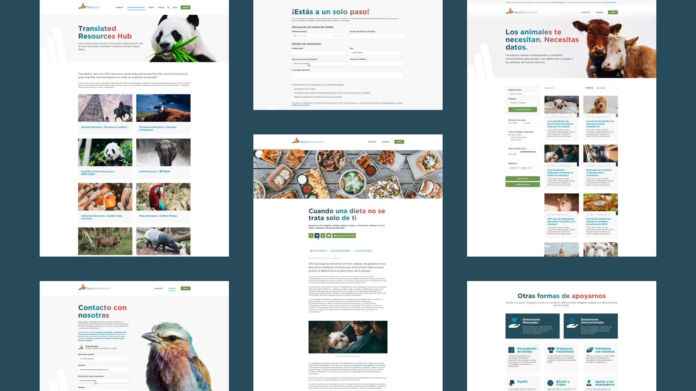
On the original site, you might occasionally find a subtle link at the top of a page or article indicating that a translation was available in a different language, an infrequent and limited indication. Another new element to the updated website that Faunalytics requested was to better utilize and showcase their translated resources and articles. To achieve this, we linked from the main site a series of links, each taking you to an external and fully translated micro-site in the chosen language with a reduced navigation focusing solely on the articles, an extender to the brand logo and means to contact and support Faunalytics as a persistent feature to the main and sub-sites.
Rich and advanced search filtering
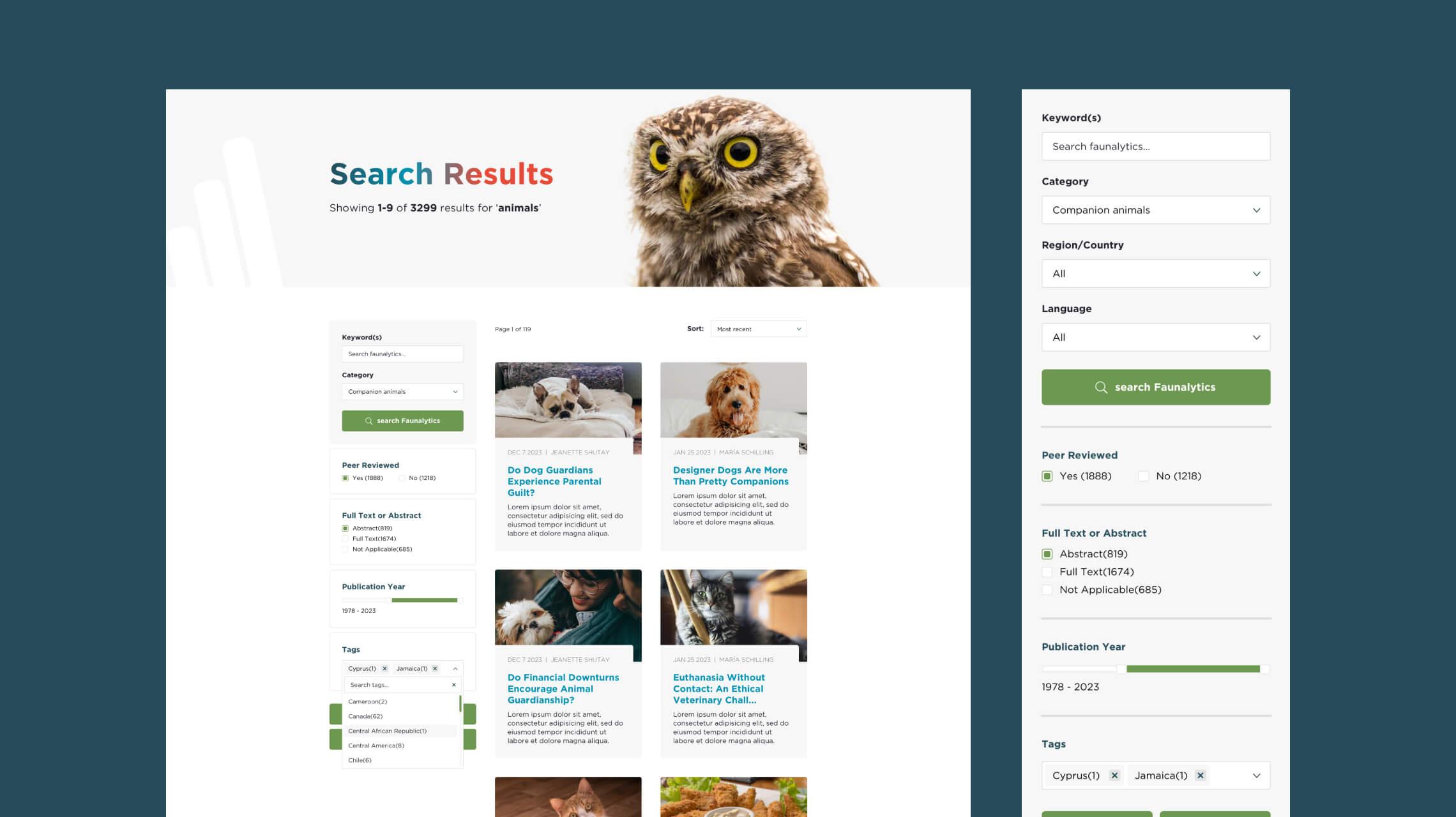
We also reinvented the search functionality for the new website to more accurately display relevant and categorized content through an expanded yet simplified search structure for filtration by the typical keyword/category/region or language, but also to refine by peer review, whether the article is full text or abstract, a slider to set a publication year range or by category tags allowed for a far more thorough and specific search of the vast number of pages and articles available at Faunalytics. This was then optimized responsively for mobile to better suit a single column format with a collapsible search and filter block.
Supporting Faunalytics and their mission
Donation was limited on the original website to a link in the header which took you to an external donation form if you wanted to show your support in Faunalytics’ efforts. We wanted to house everything on the new website itself with a more prominent presence globally, so included a persistent support block on most pages as part of the footer as well as the existing donation call to action in the header navigation. The donate form became it’s own hosted page with a streamlined form, additional messaging to convey how much of a benefit to the cause donation truly is, and the importance of supporting Faunalytics’ mission.
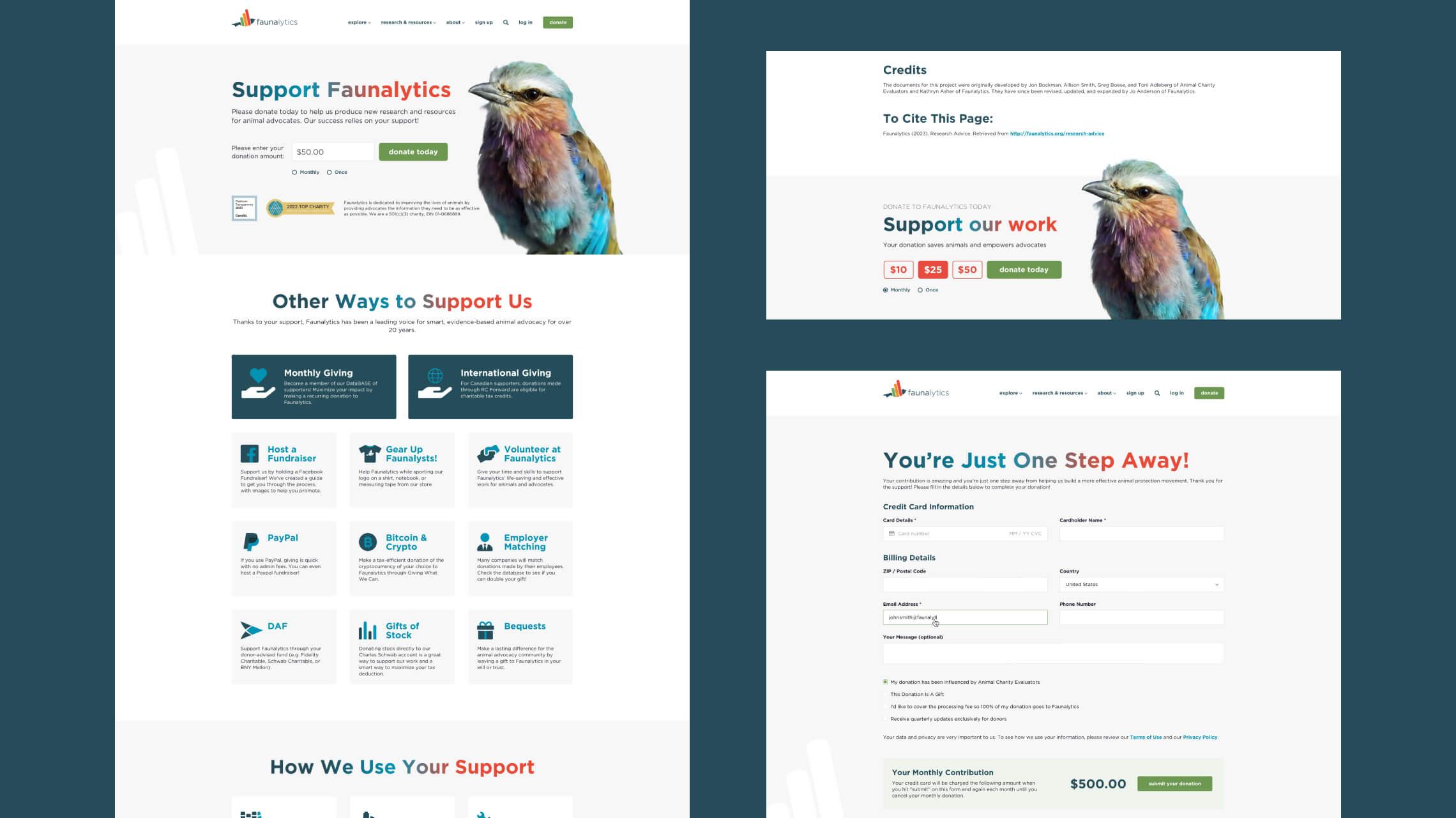
Donation is not the only way to show support. Getting involved through volunteering, hosting fundraisers, matching donations through companies on the Faunalytics database, gifting stock and more are all viable ways to show support for their work.
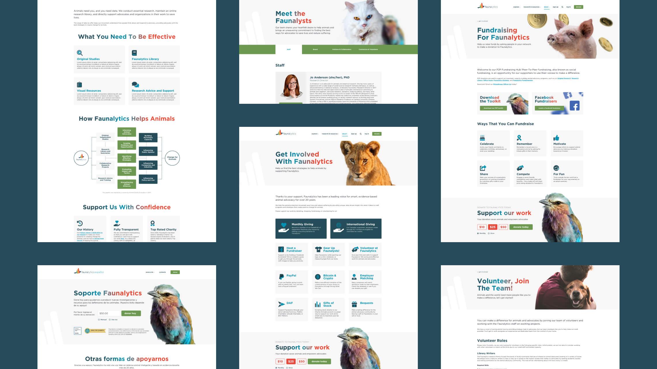
Every section as important as the next
While the original reporting and articles are the quintessential core of the messaging, every section of the website had crucial detail that improved the understanding and awareness of the user, and enhanced one another as a result. So careful consideration on how to improve layouts, parsing large amounts of text-rich content and ensuring the user experience was as powerful as the articles themselves was a constant factor to address during the design phase, including but not limited to:
- Introducing imagery for partner brands and external resources to improve the flow of content.
- Accordion heavy pages were often restructured to bring the content to the forefront of the page where practical.
- Implementation of landing hub templates that teased and highlighted core subsections of content.
- Mini hub pages with tabbed navigation were also created within the structure of the site for larger sections such as the Visual Resources hub (link), Fauna Connections or Faunalytics very own Original Studies sections.
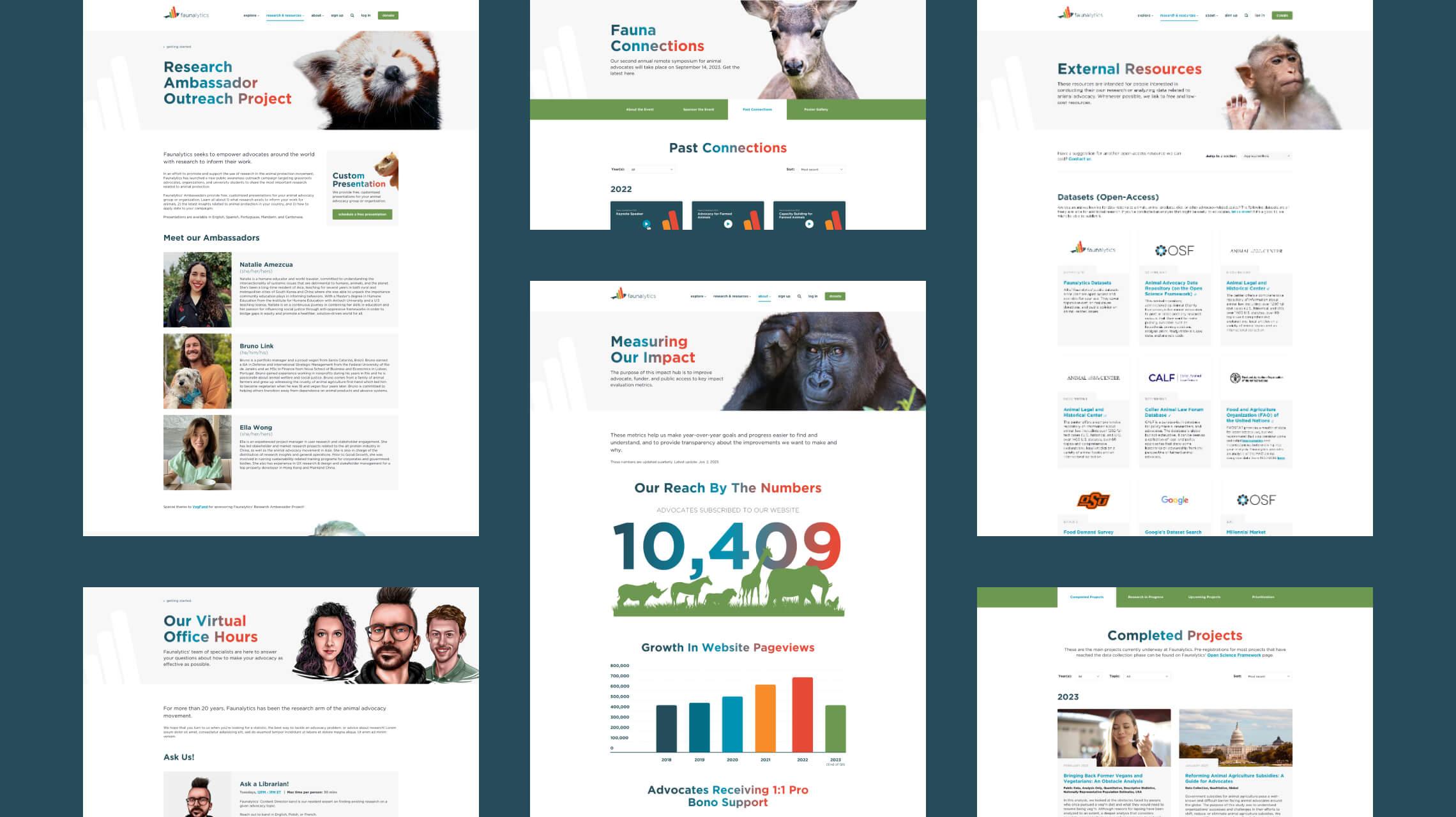
Working closely with the client lead on the project, we gained excellent insight into the most important aspects of the site globally, and then refined layouts using best practice standards for UX and accessibility, across a design suite spanning over 100 pages of mobile and desktop concepts, plus revisions! The end results is a vast, easy to navigate and most importantly, comprehensive introduction to animal welfare.
